Flyer Design
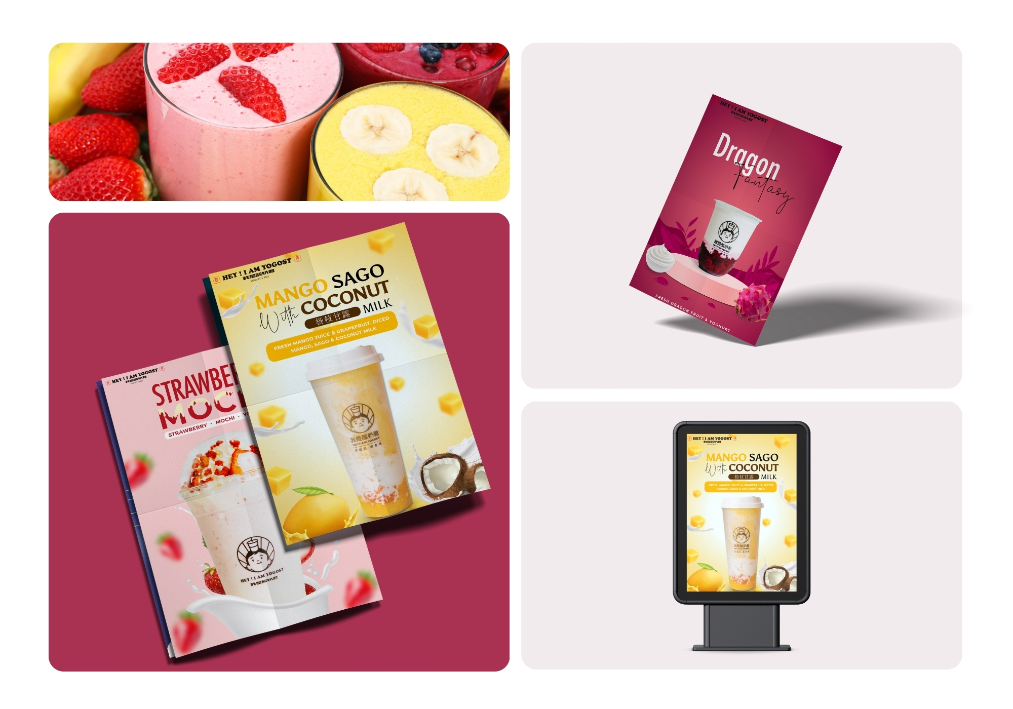
Hey! I Am Yogost
Vibrant flavor-forward flyer set for a bubble tea brand, designed to make every fruit and milk tea feel irresistibly fresh across print and digital signage.
Vibrant flavor-forward flyer set for a bubble tea brand, designed to make every fruit and milk tea feel irresistibly fresh across print and digital signage.
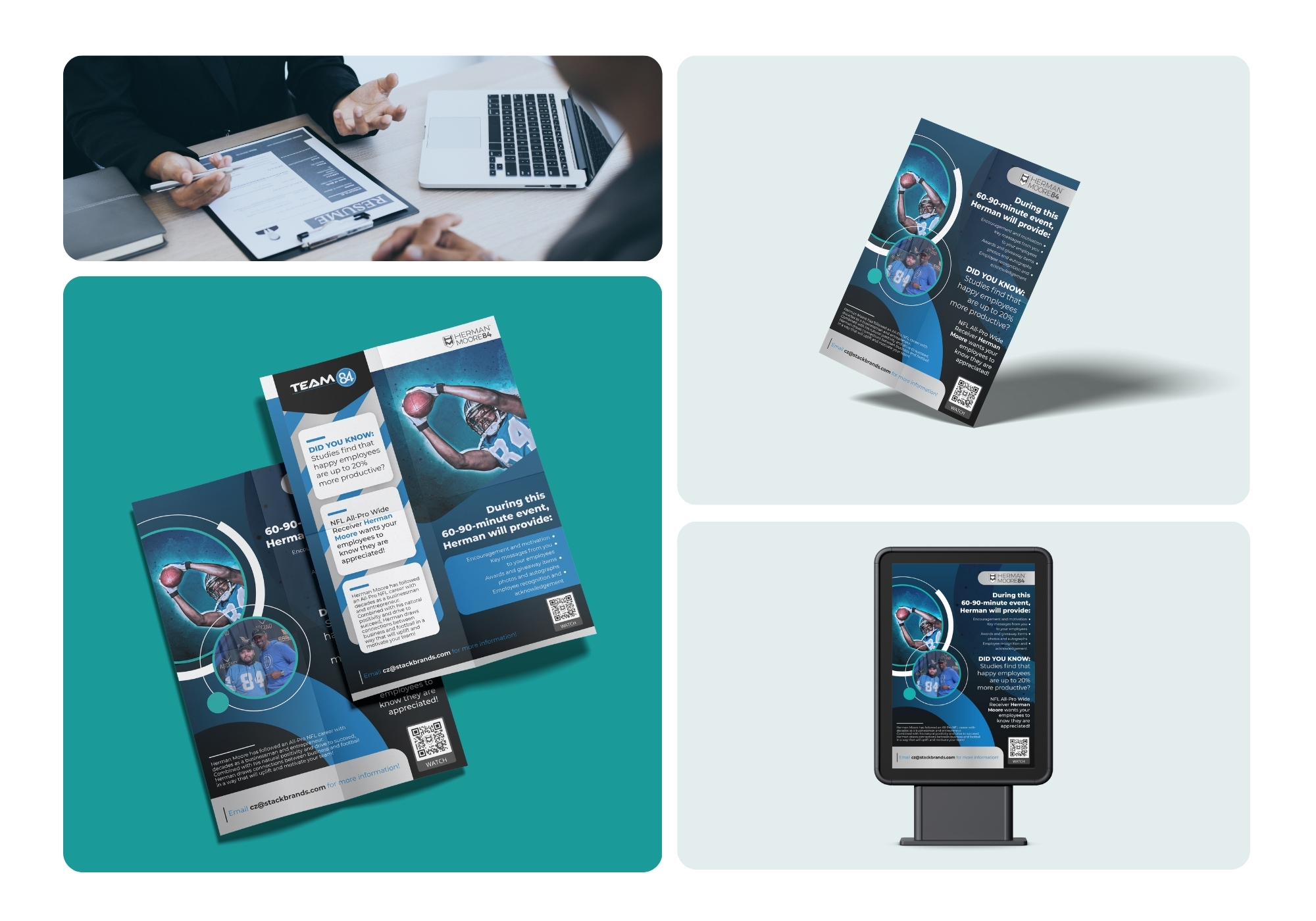
A bold corporate booking flyer for an NFL All-Pro's employee engagement events, balancing athletic energy with a clean, professional pitch.
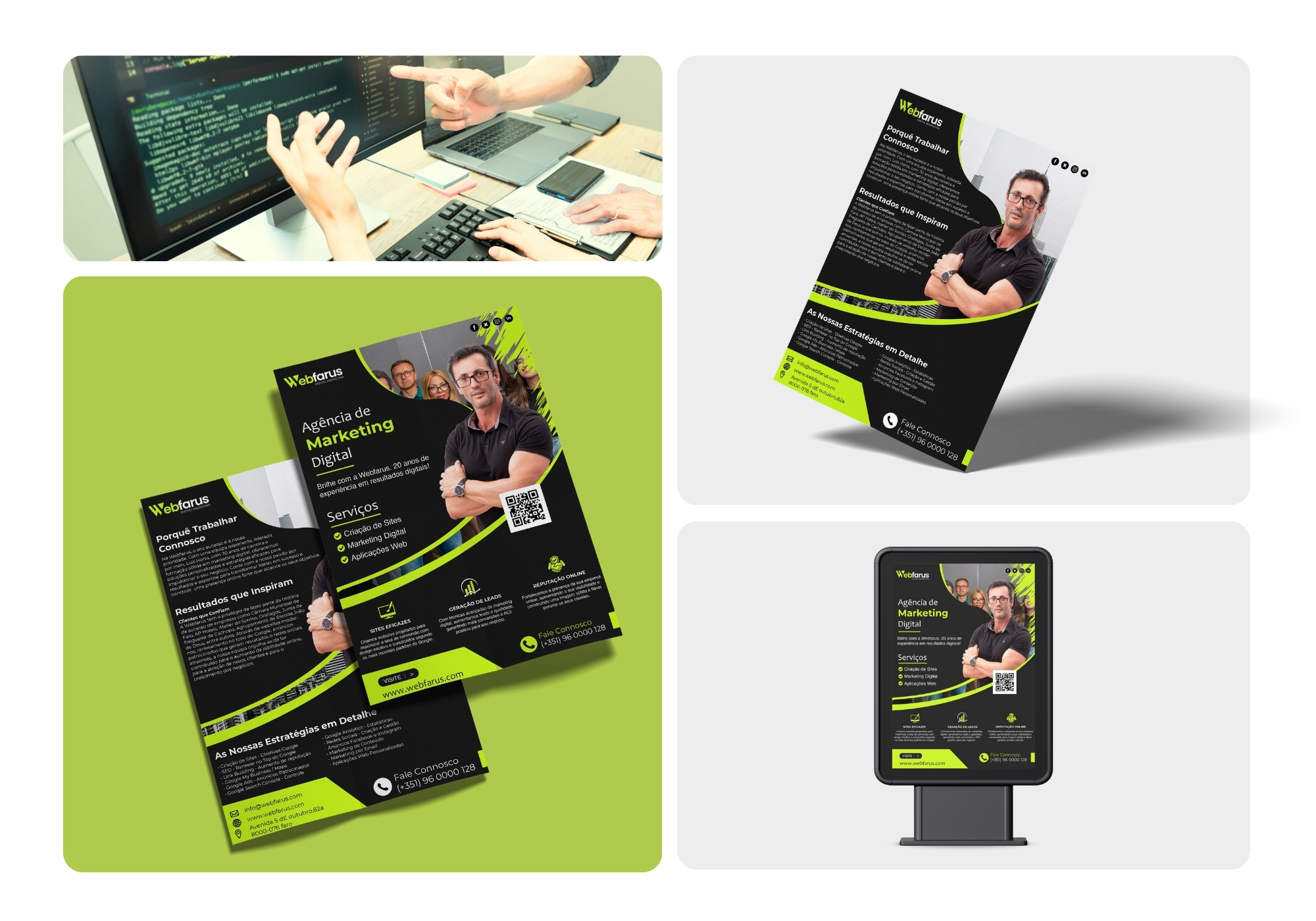
A sharp, high-contrast flyer built to give Webfarus's digital marketing services instant authority and a results-first pitch.
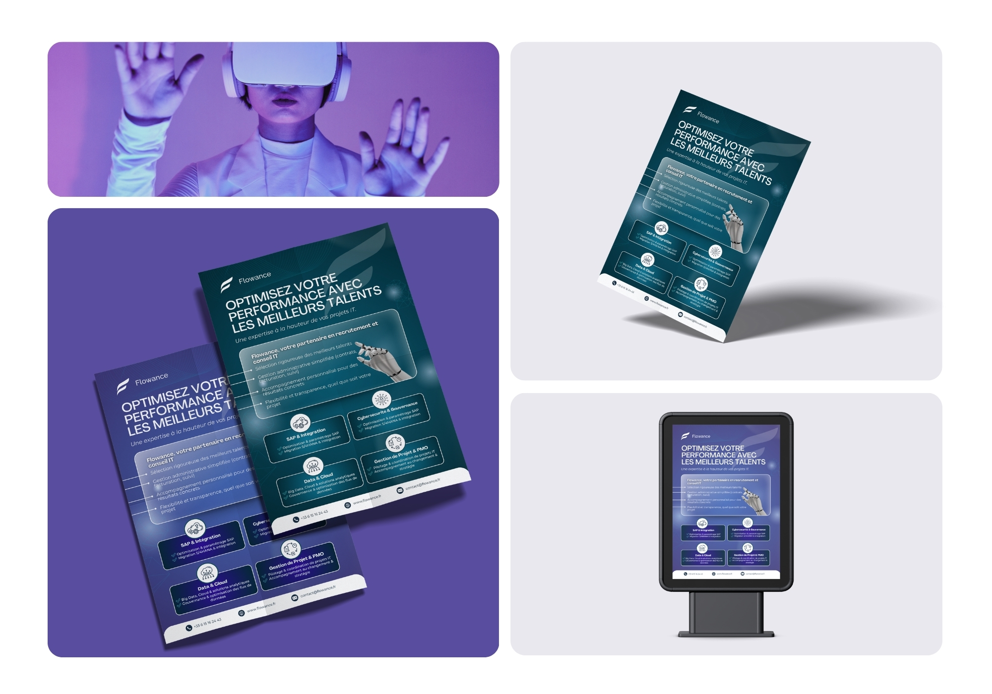
A sleek, tech-forward flyer built to position Flowance as a precise, future-ready partner for IT recruitment and consulting.
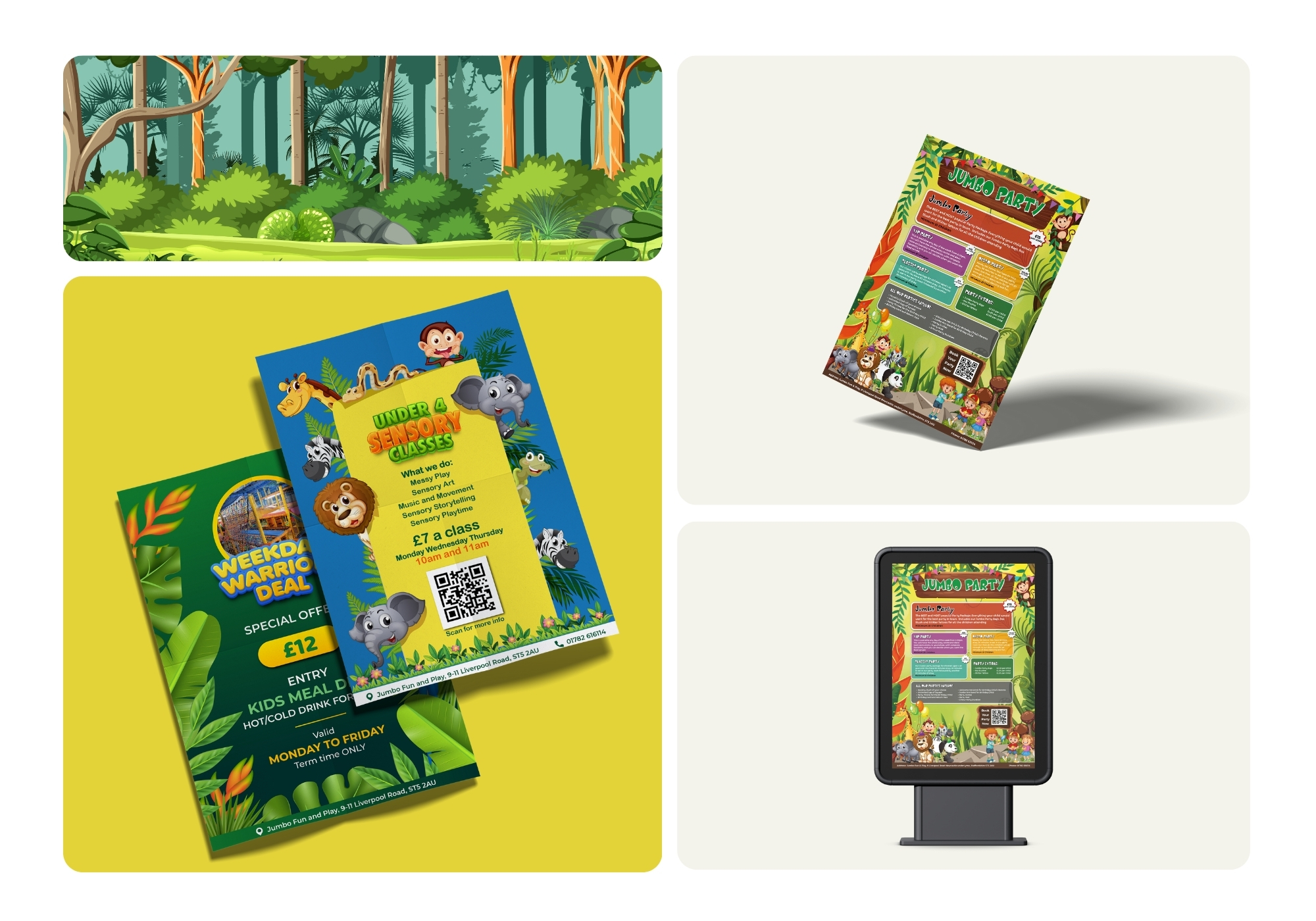
A playful jungle-themed flyer set built to turn Jumbo Fun and Play's parties and classes into easy, colorful bookings for parents.
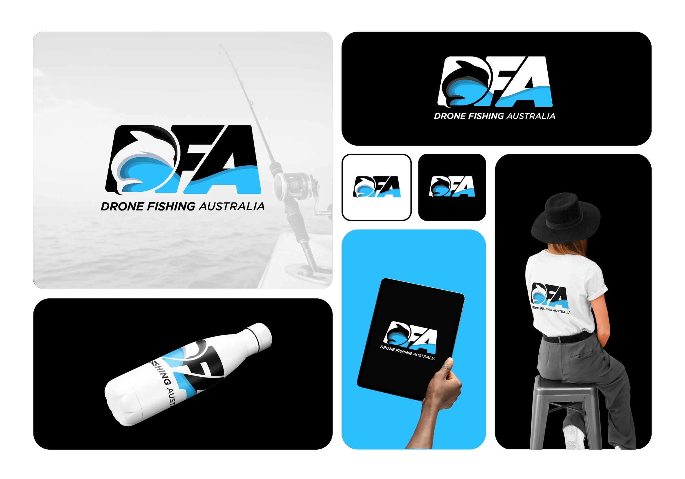
DFA wanted something that made 'drone fishing' sound like a real sport, not a gimmick. So the fin does double duty: half fish, half wing, wrapped in ocean blue that works just as well on a rod reel as it does on a t-shirt.
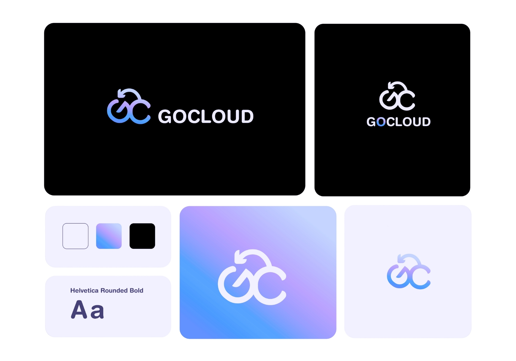
GoCloud needed a mark that felt like tech without feeling cold. The looping 'GC' solved that by doubling as a cloud and a refresh icon at once, soft gradients doing a lot of the emotional heavy lifting here.
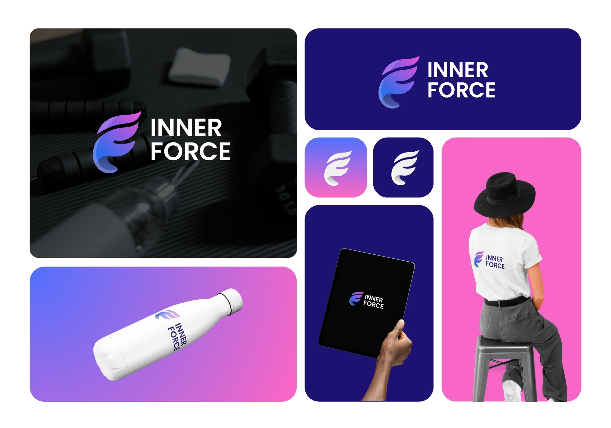
This fitness brand didn't want the usual barbell-and-flame cliché everyone's seen a hundred times. What we landed on instead was a winged 'F,' gradient-drenched in purple and pink, that reads more 'premium studio' than 'budget gym.'
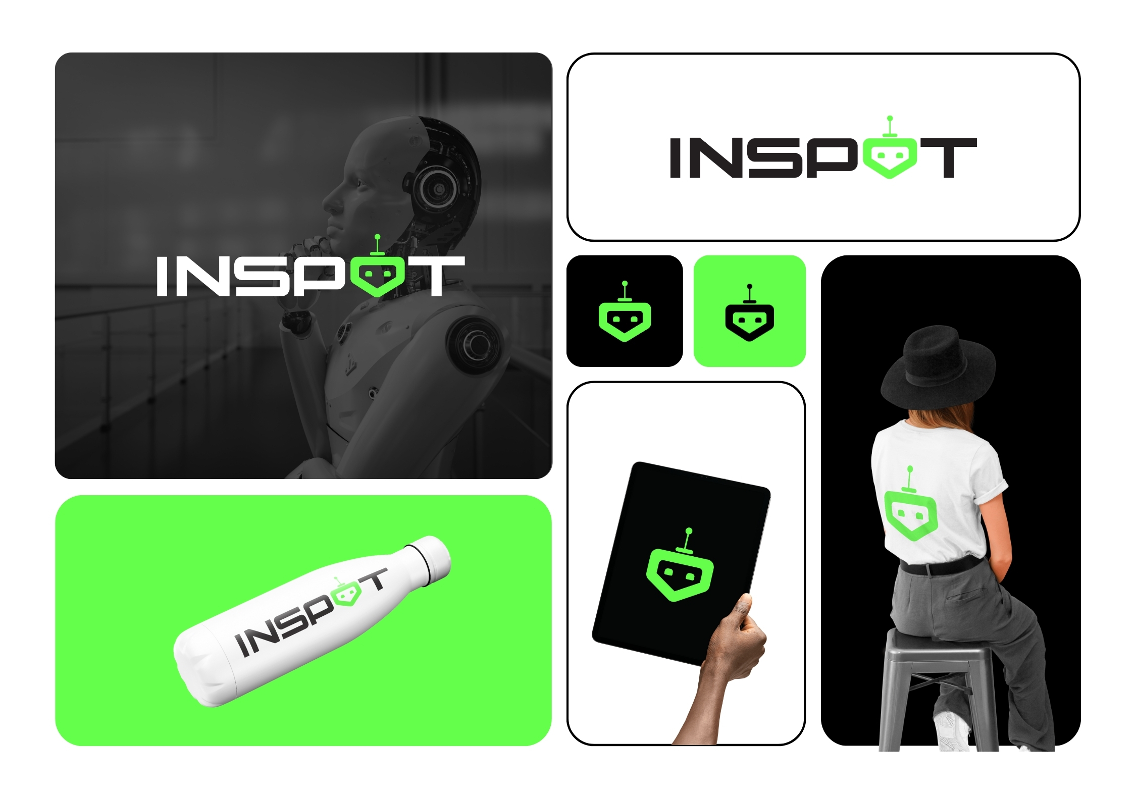
The goal for Inspot was to make AI feel less like HAL 9000 and more like a friend. Tucking a tiny robot face into the 'O' did exactly that; the neon green keeps it playful without losing the tech edge.
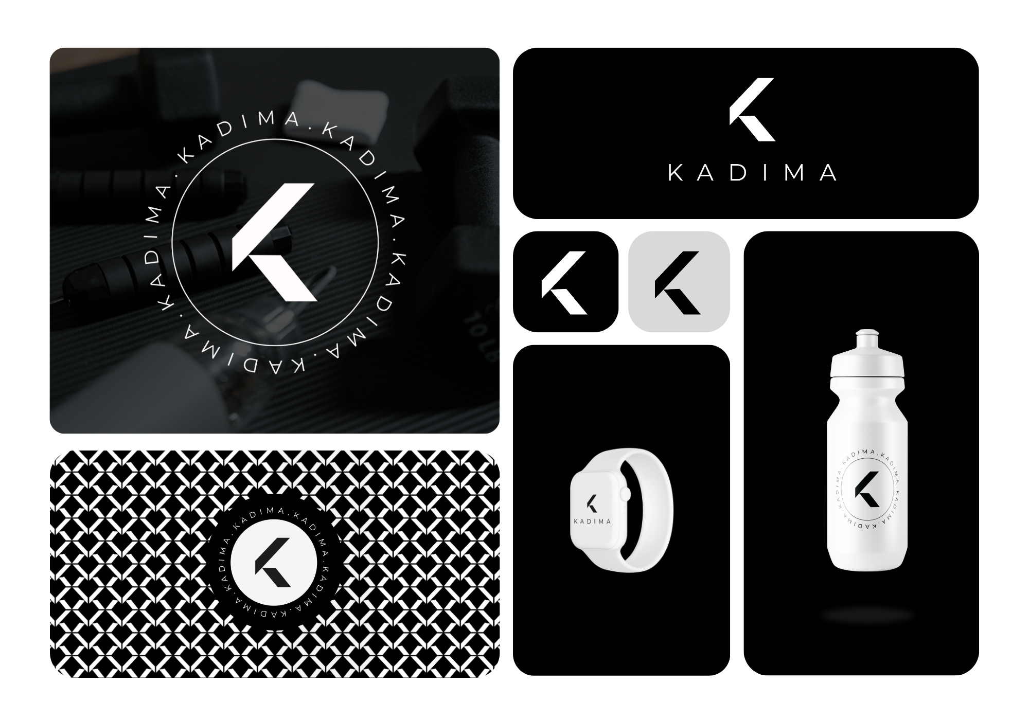
Kadima's whole pitch was minimalism that still feels expensive. A single sharp 'K,' rendered strictly in black and white, does the job on its own, then gets stamped inside a circular badge for merch that actually looks worth owning.
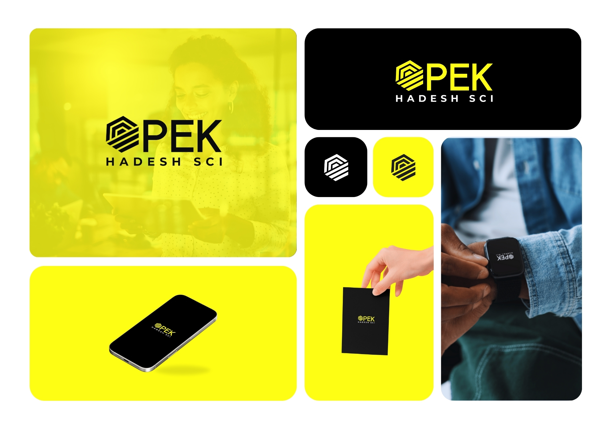
Pek needed an identity with real technical edge, something that looked engineered rather than designed. The faceted hexagon delivers that, and the black-and-yellow combo keeps it legible whether it's on a screen or a wristband.
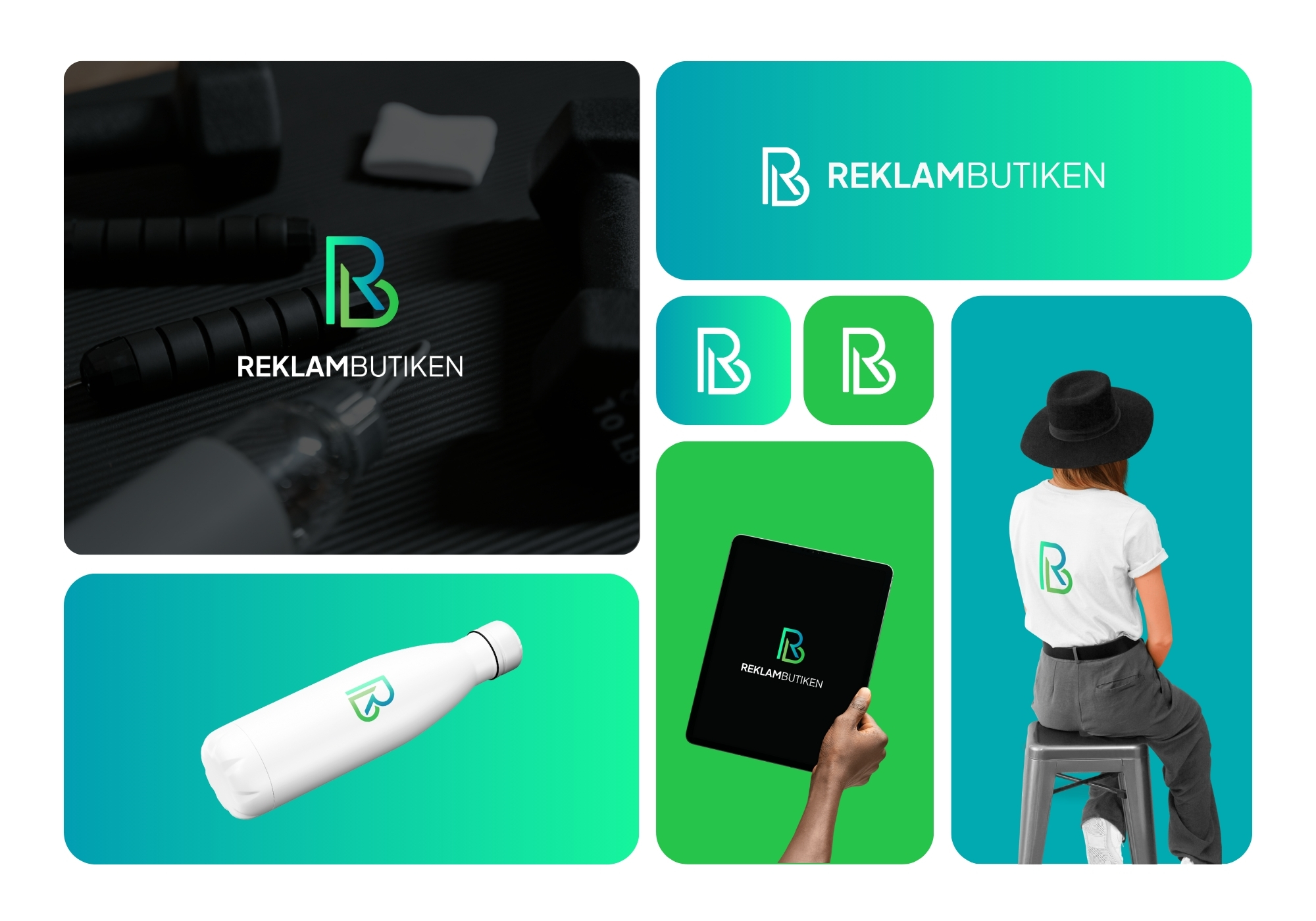
Simple was the whole point for this Swedish promo company, but simple can't mean boring. Locking the R and B together into one shape solved that, and the teal-to-green gradient gives it just enough personality to not disappear.
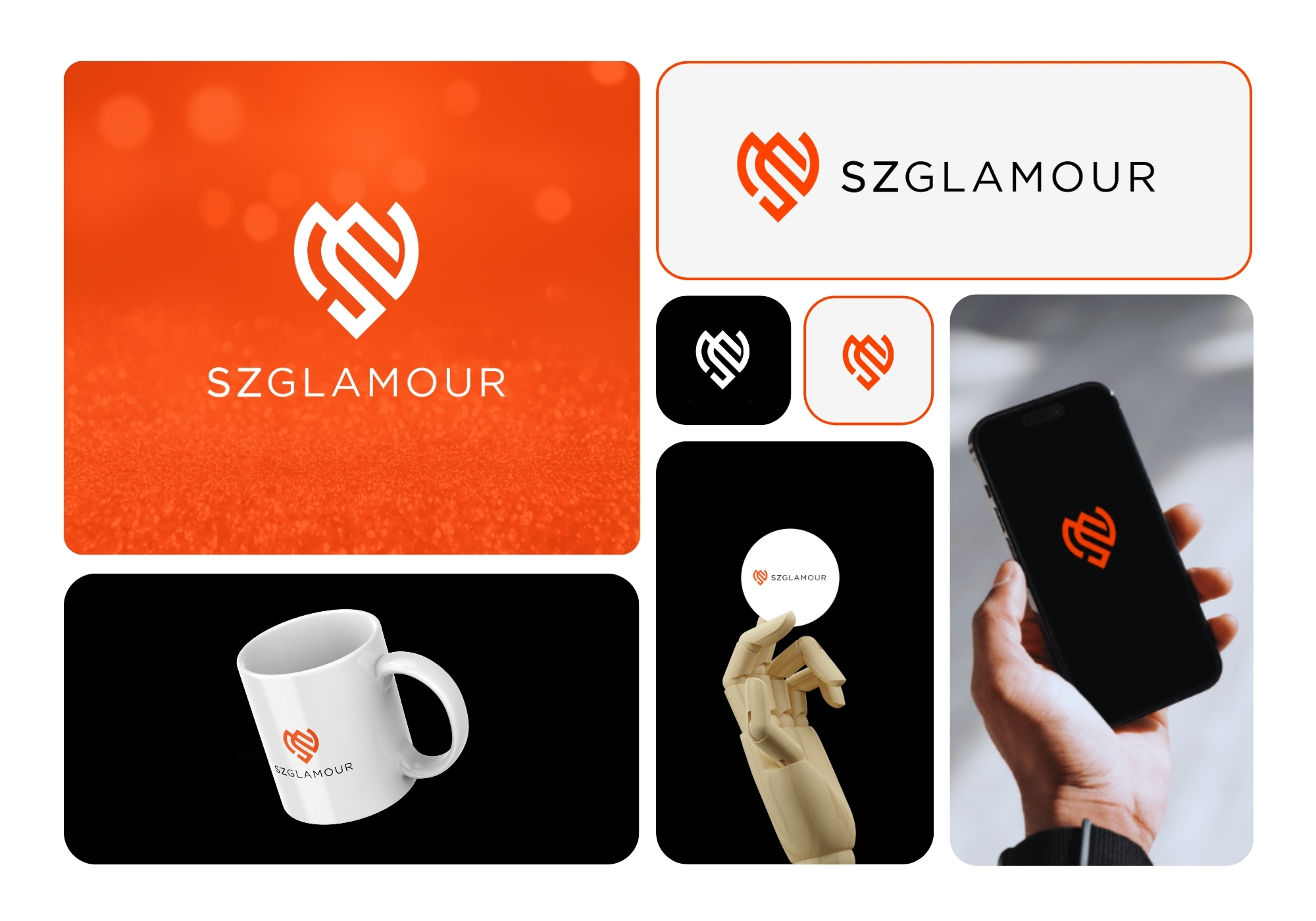
This beauty brand wanted warmth without losing sophistication, a tricky balance. The heart hidden inside the interlocking S and Z pulls that off, and the orange keeps things feeling personal rather than corporate.
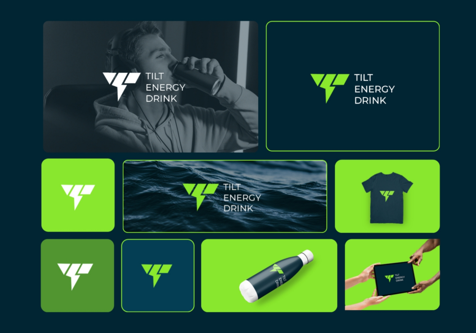
Gamers don't respond to subtlety, so subtlety wasn't on the table here. The lightning-bolt T in electric green against navy hits like the energy drink itself: fast, loud, impossible to ignore on a shelf.
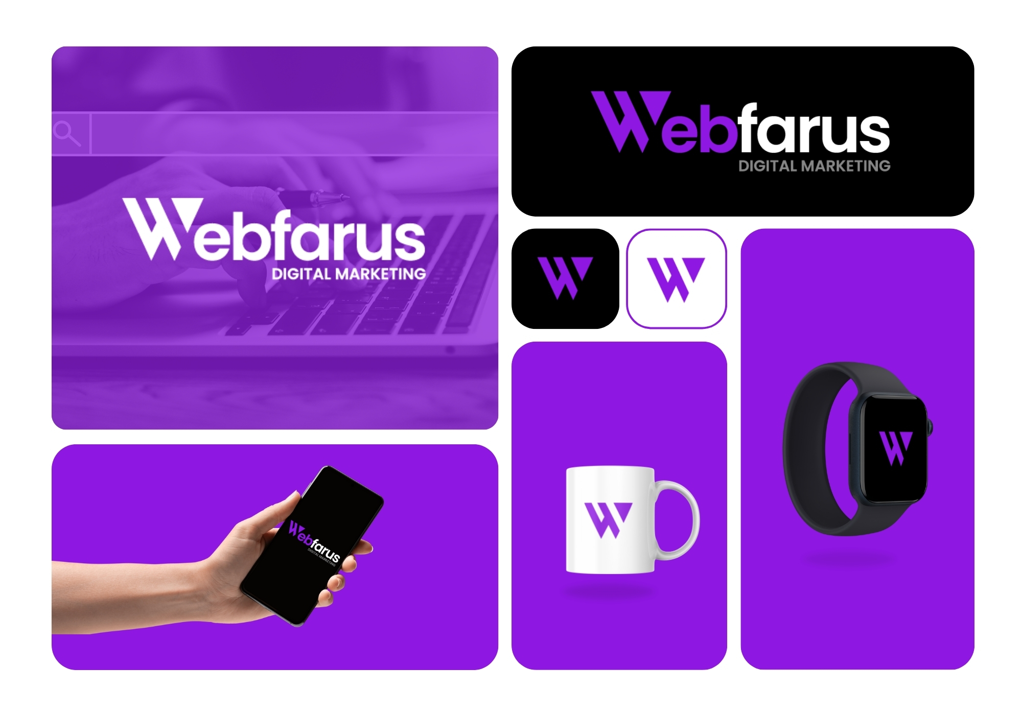
A digital marketing agency has to look like it can market itself first. The bold W in purple and white does exactly that, holding its own on both a dark pitch deck slide and a bright landing page.
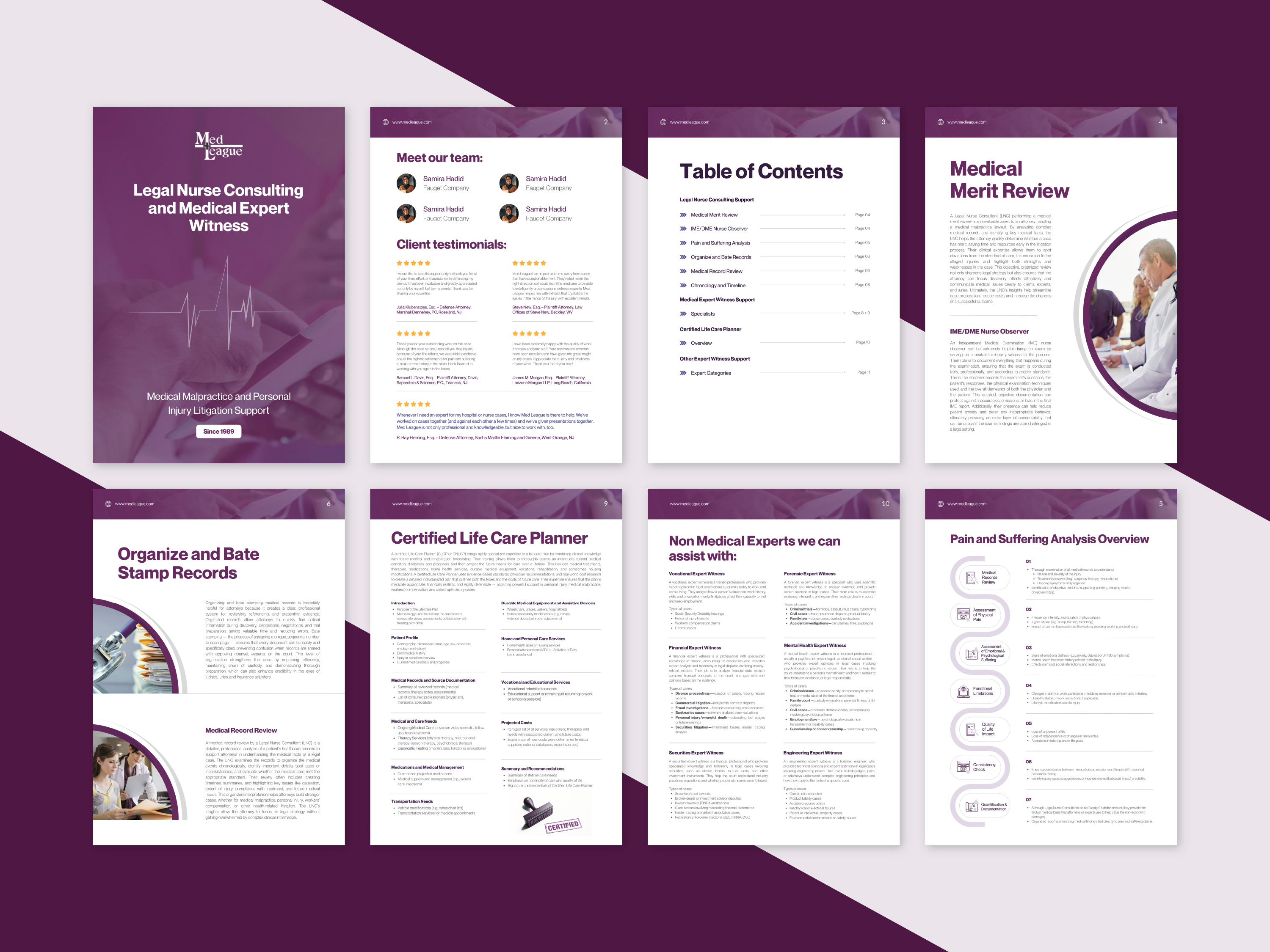
A law firm needed to make expert witness services feel credible, not clinical. This did it with a clean purple layout that lets testimonials and case categories do the talking.
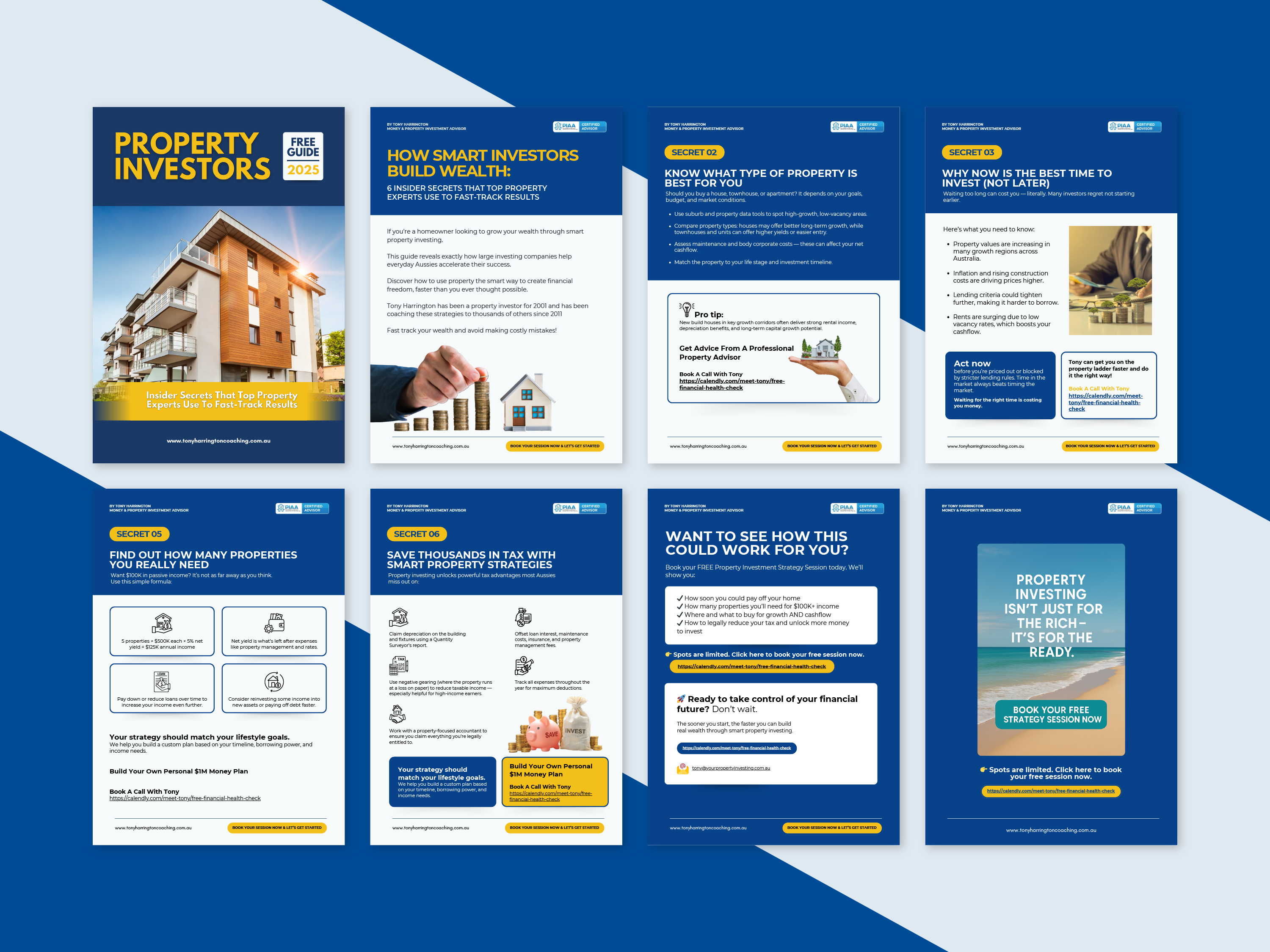
Tony Harrington needed a lead magnet that turned '6 secrets' into real bookings. Bold navy and gold headlines carry each tip straight to a call-to-action, no wasted scroll.
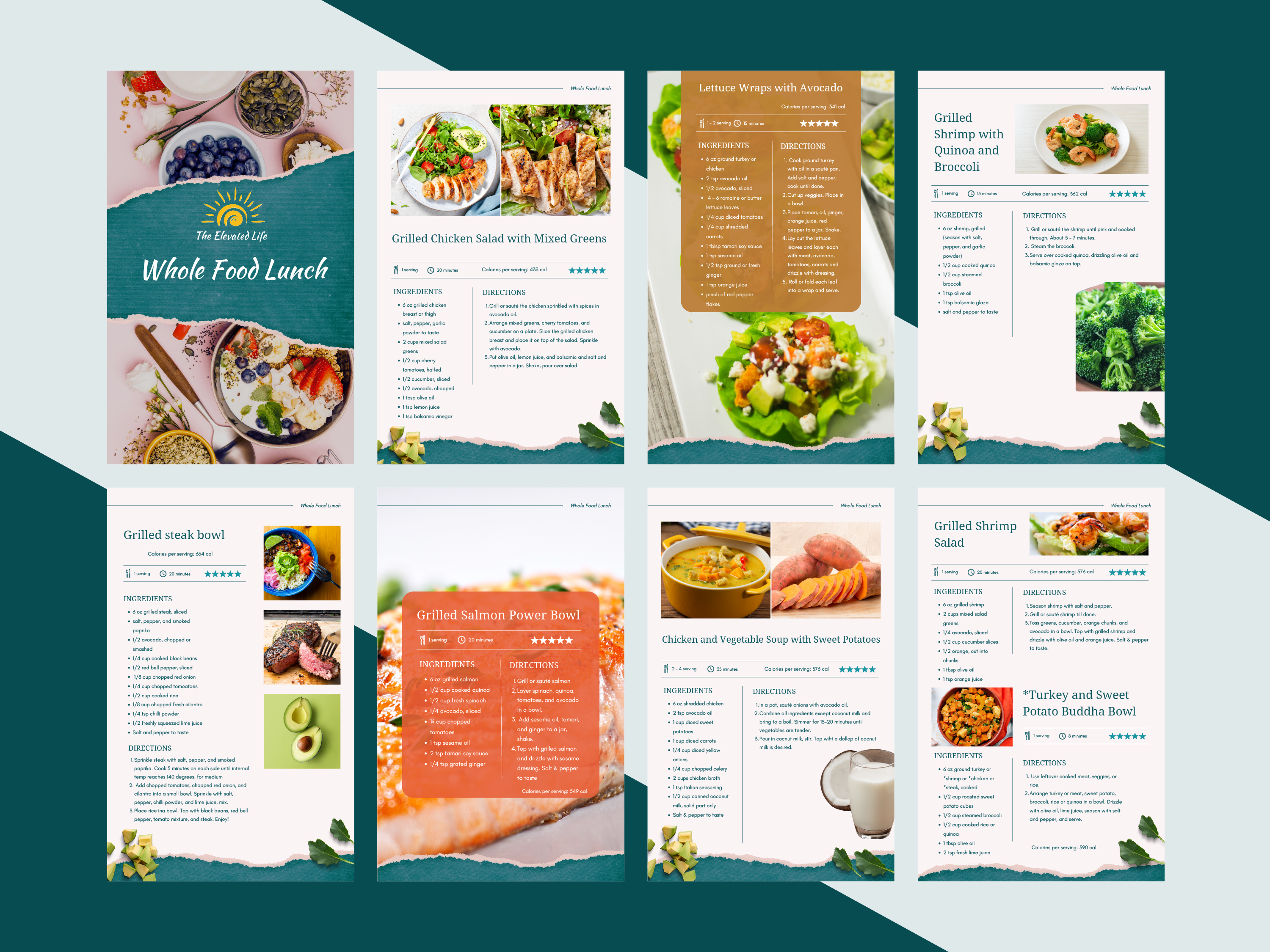
This recipe ebook had to make healthy eating feel indulgent, not restrictive. Warm torn-paper textures and bright food photography make every dish look worth cooking.
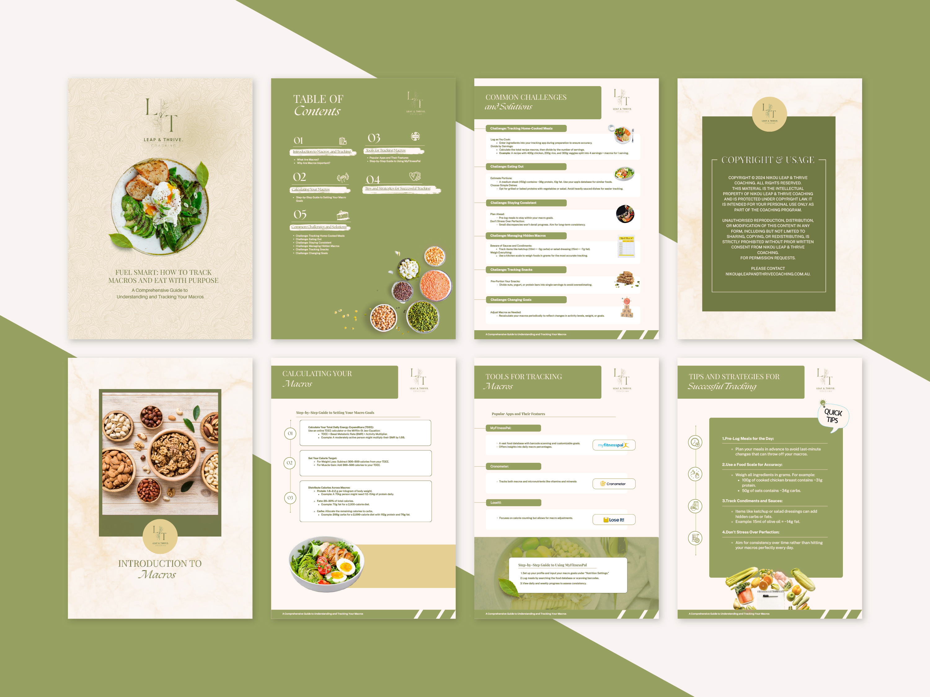
Macro tracking is dry by nature, so the brief was to make it feel approachable. Sage green and cream tones turn a technical guide into something closer to a wellness journal.
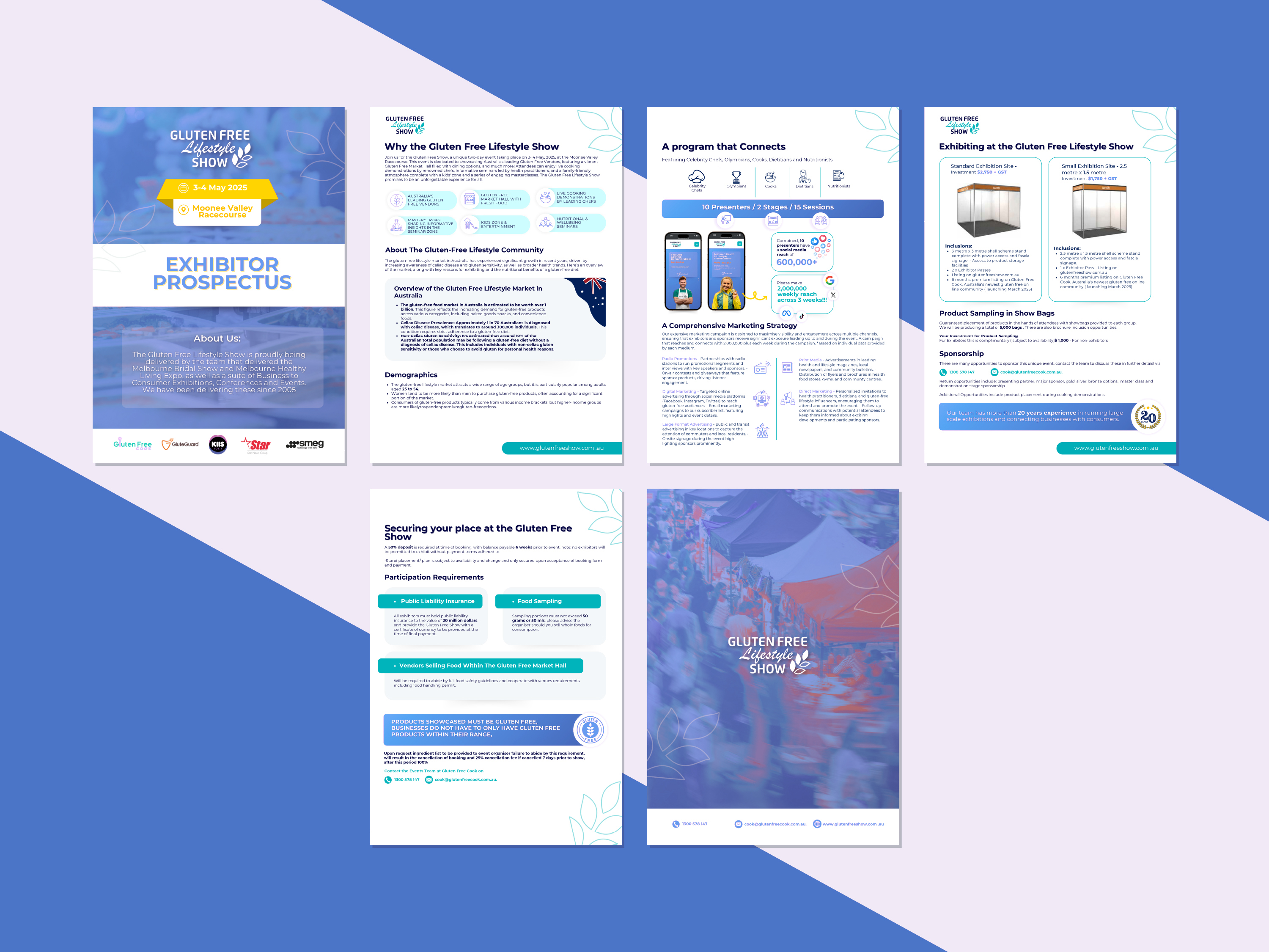
Exhibitors needed hard numbers to justify booking a stand. Clean blue infographics turn reach stats and floor plans into a pitch that basically sells itself.
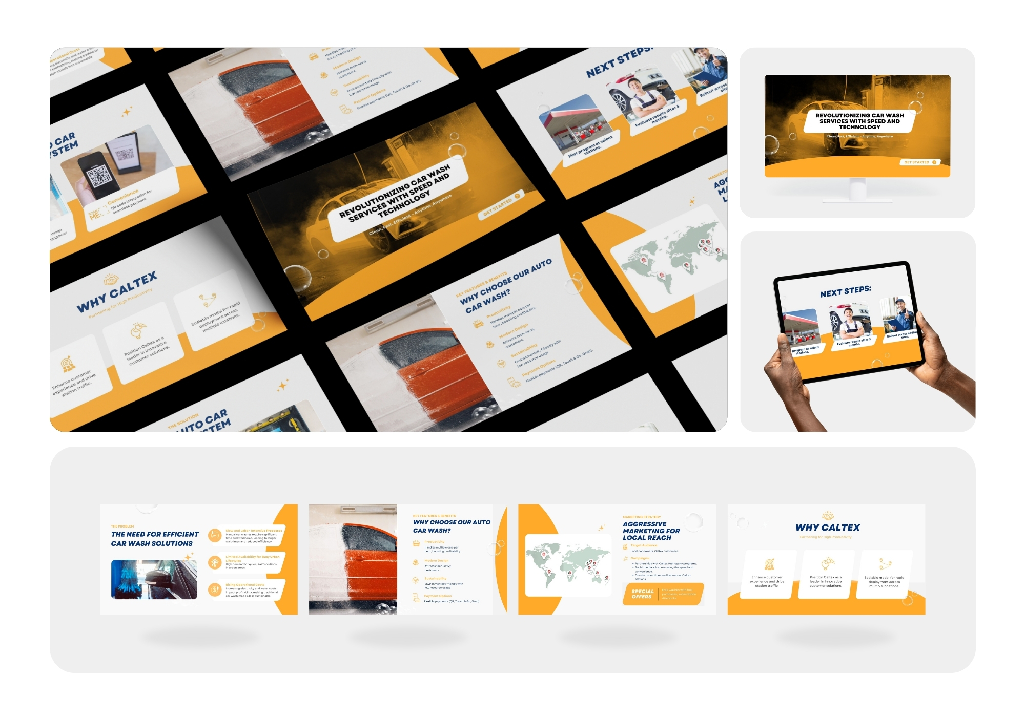
Caltex wanted the pitch to feel fast and modern, matching the service itself. Bold orange and motion-blur car imagery keep the deck moving at car-wash speed.
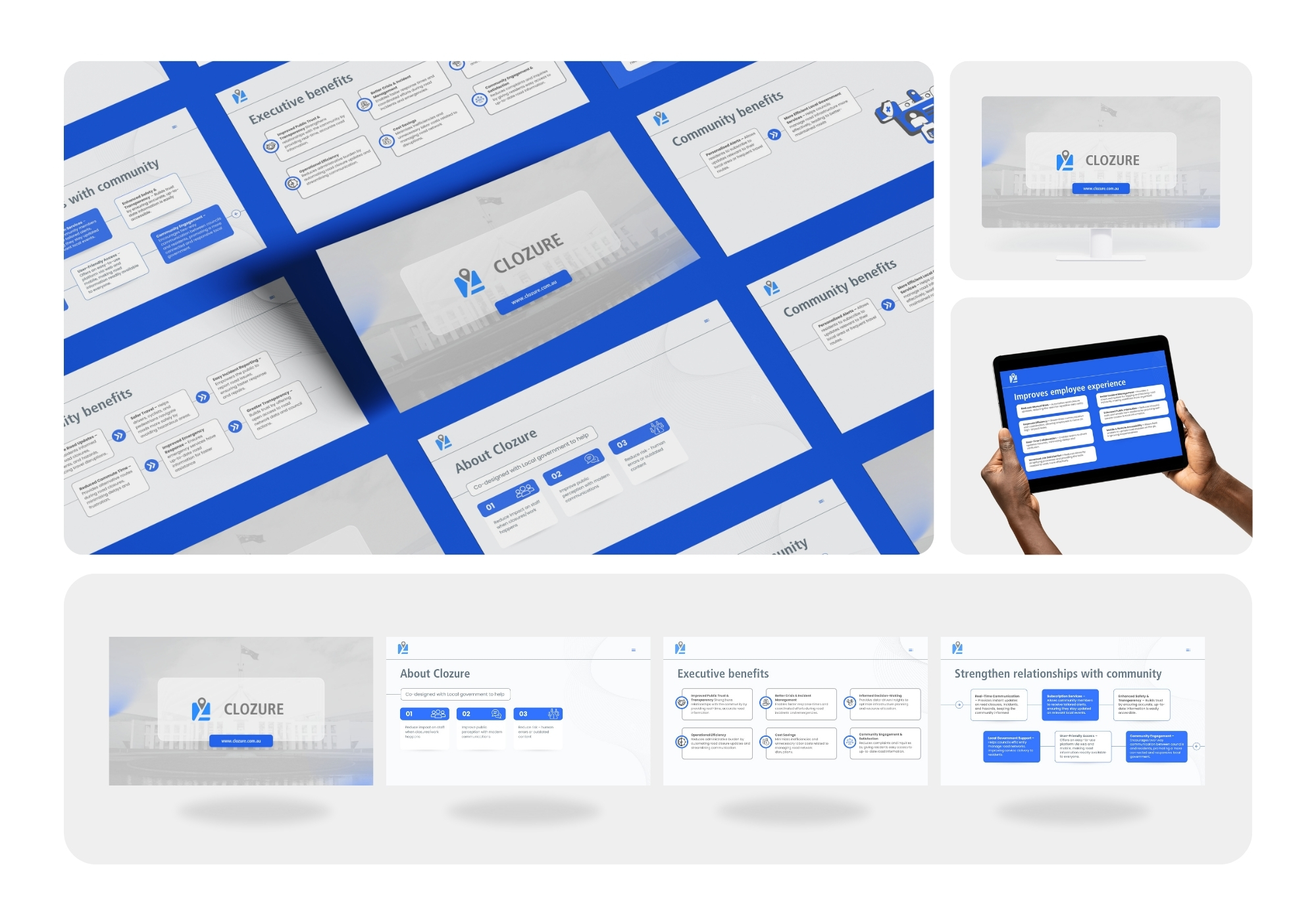
Local councils needed to see the community upside, not just the tech. Icon-led benefit cards make the pitch land clearly for both residents and executives.
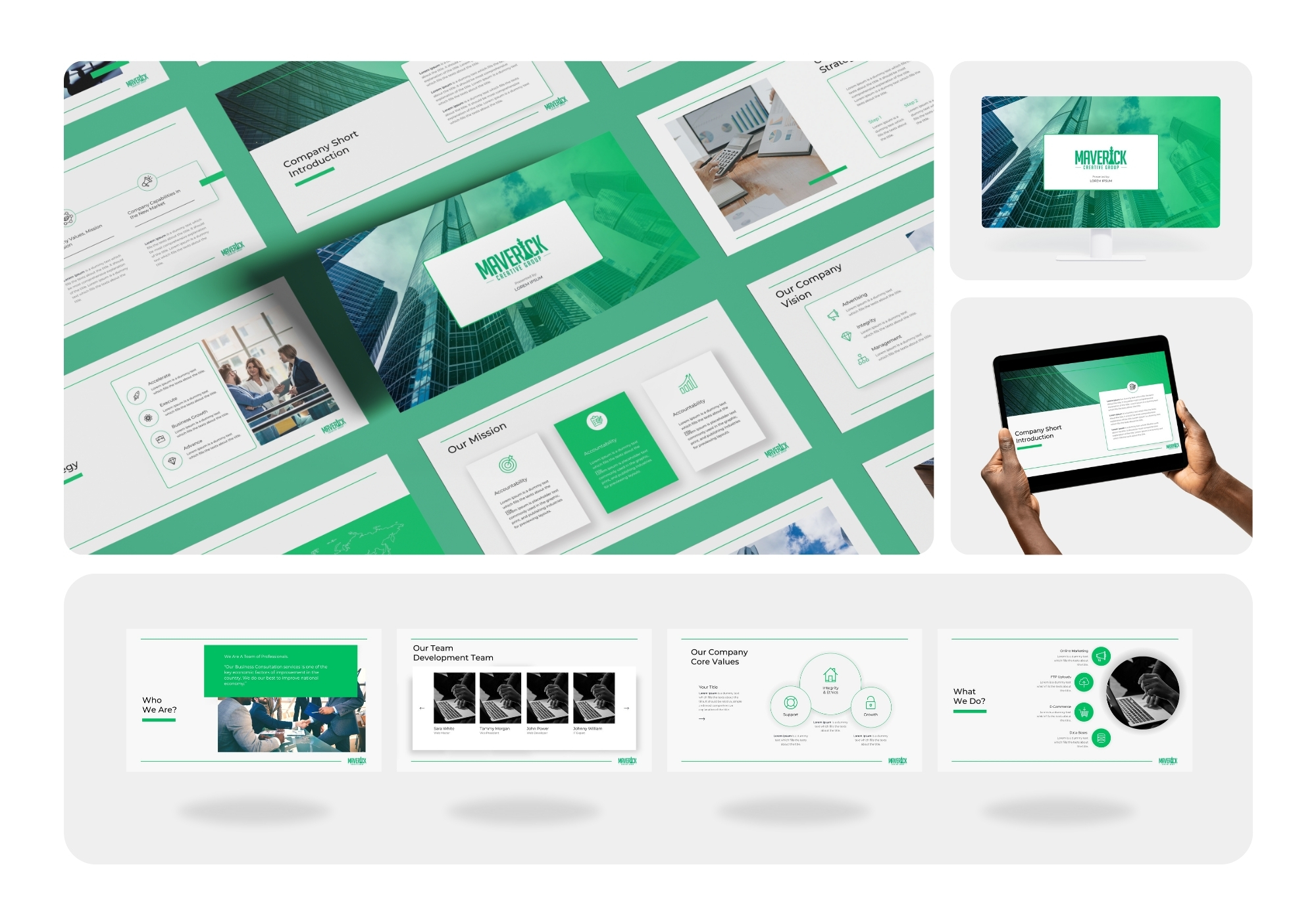
This deck template had to read as premium without real client content yet. Sharp green-on-white grids and skyline photography carry the polish on their own.
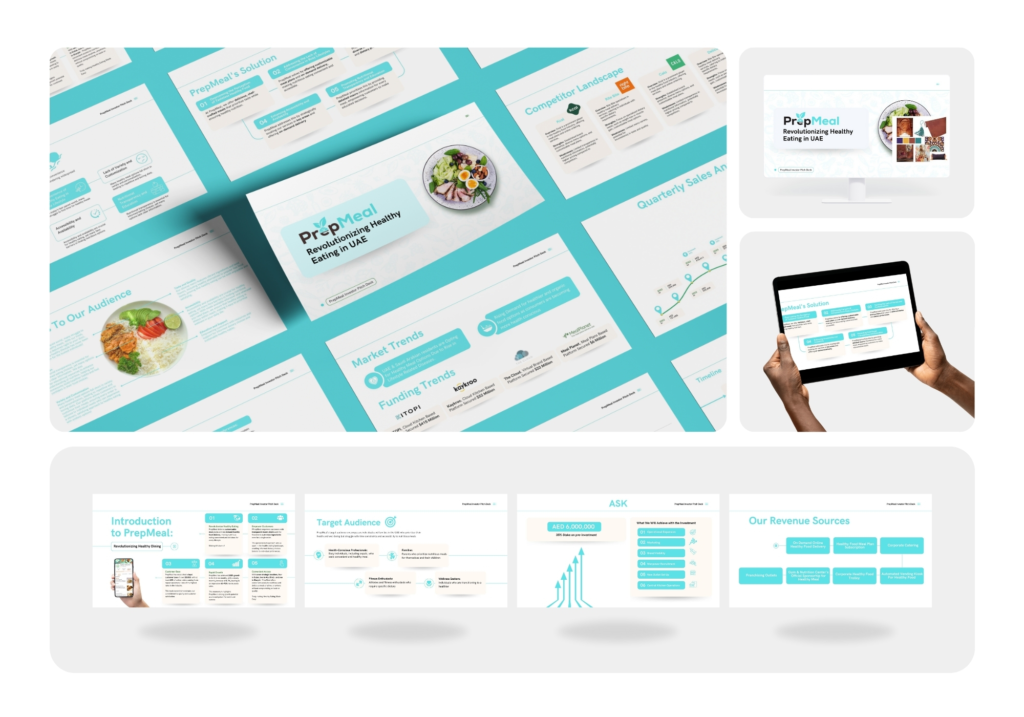
Investors needed the market opportunity spelled out fast. Clean teal infographics turn funding trends and competitor gaps into a pitch that's easy to skim and easy to say yes to.
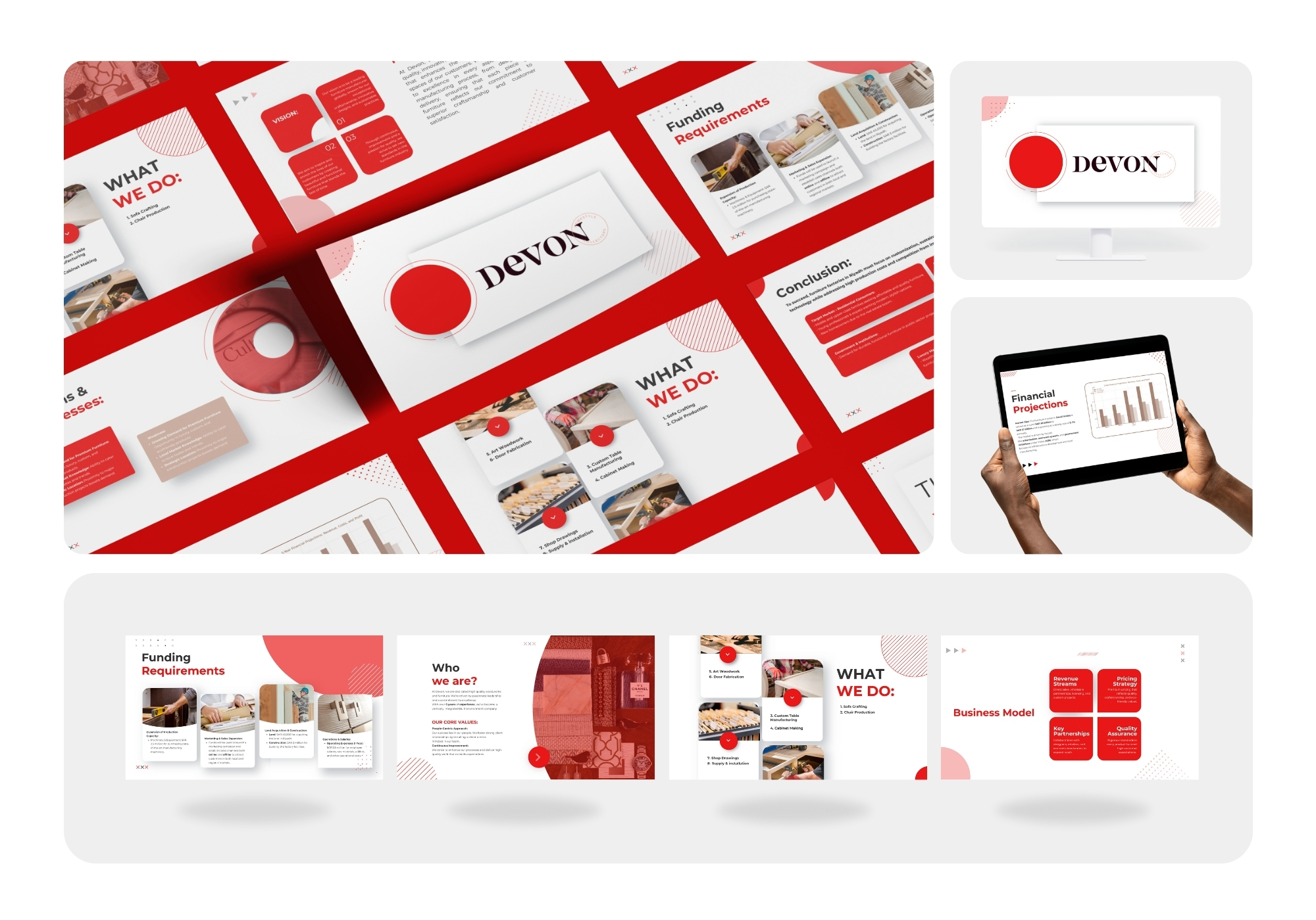
A furniture brand wanted to feel bold, not rustic. Deep red and crisp serif type give this pitch deck a confident, design-forward edge.
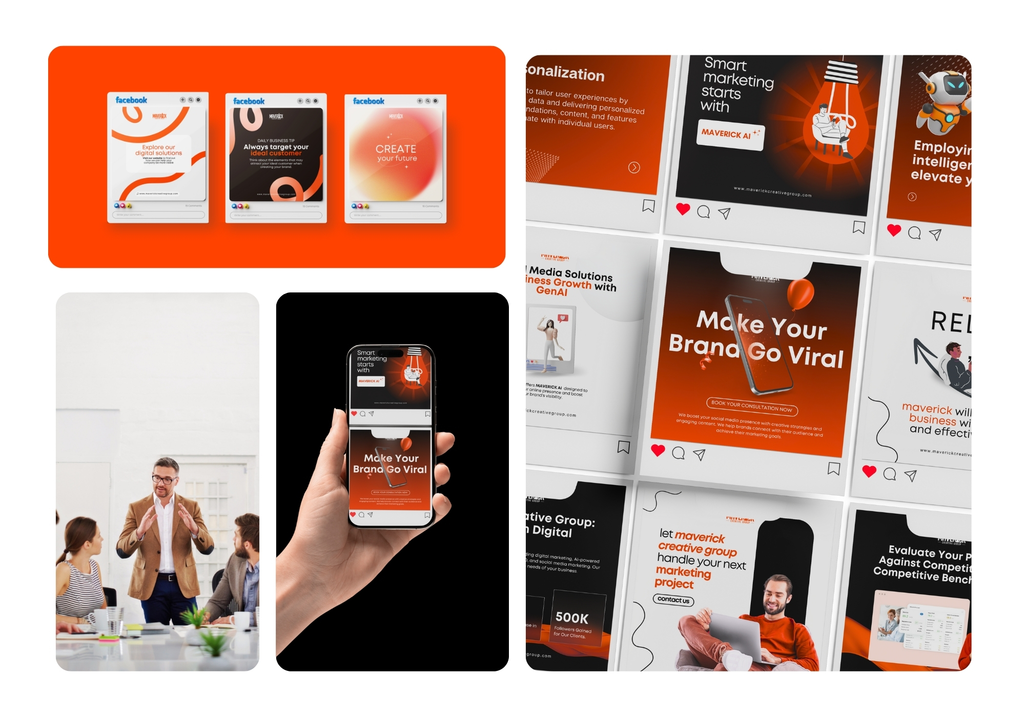
Bold orange-and-black social kit for an AI-powered marketing agency. Clean grid layouts pair confident headlines ('Make Your Brand Go Viral,' 'Smart Marketing Starts With Maverick AI') with sleek illustrations and mockups, positioning the brand as sharp, modern, and results-driven
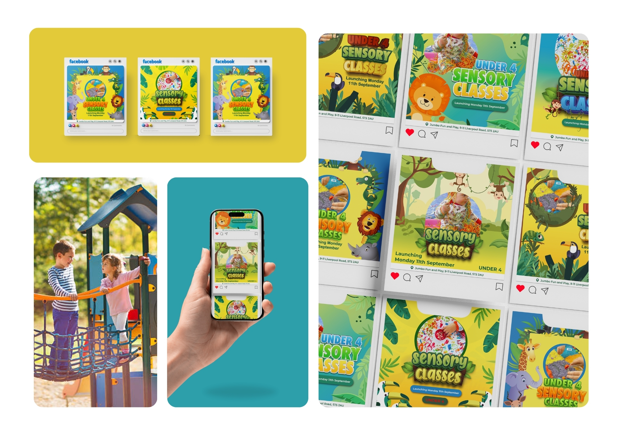
Playful jungle-themed campaign announcing a new sensory class launch. Bright yellow-and-green palette, hand-illustrated animals, and real photos of tactile play create a warm, inviting feel that speaks directly to parents of young children.
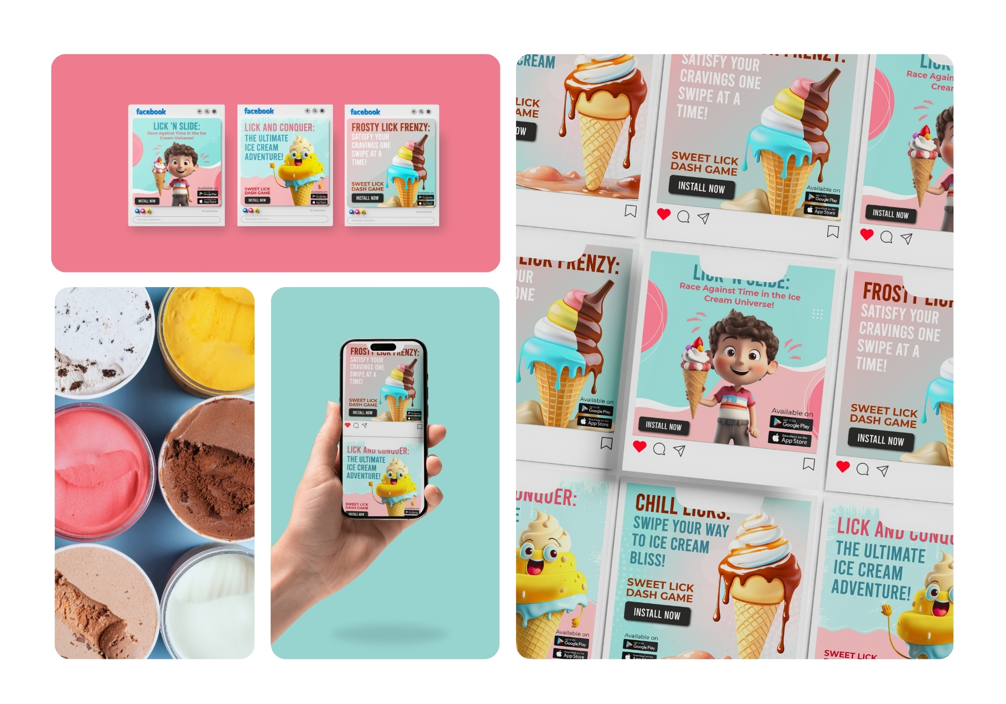
Fun, candy-colored ad set for an ice cream-themed mobile game. 3D character art and drippy dessert visuals pair with punchy taglines ('Race Against Time,' 'Chill Licks') and clear install CTAs — built to catch the eye mid-scroll and drive app downloads.
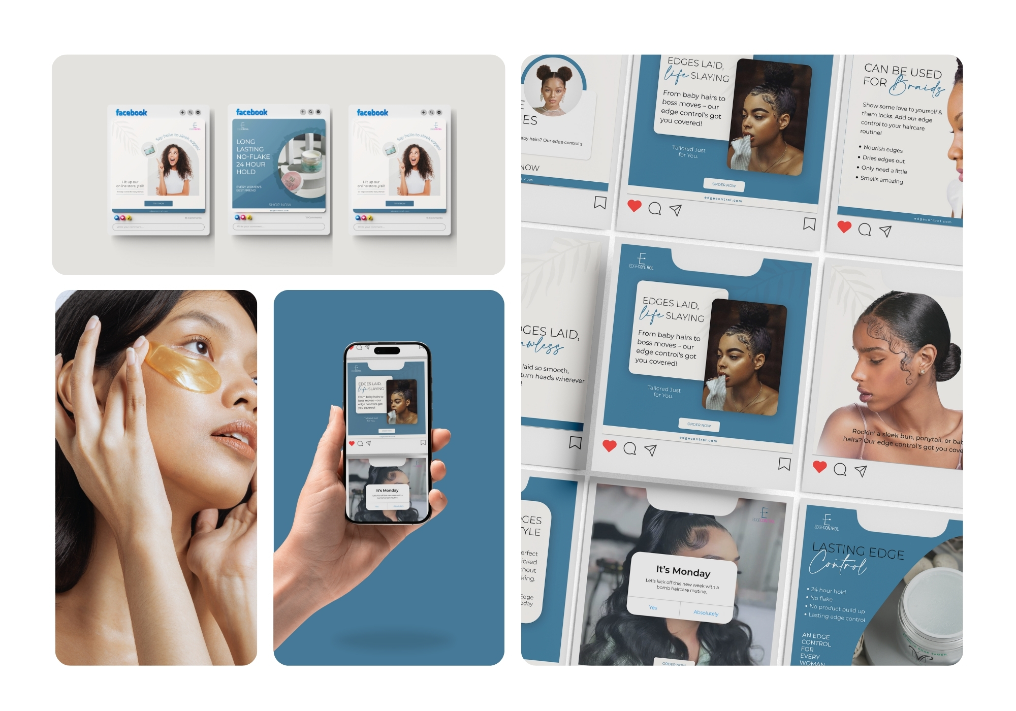
Elegant, moody blue-toned beauty campaign for an edge control haircare line. Editorial-style photography and confident copy ('Edges Laid, Life Slaying') balance product benefits with an aspirational, lifestyle-driven tone.
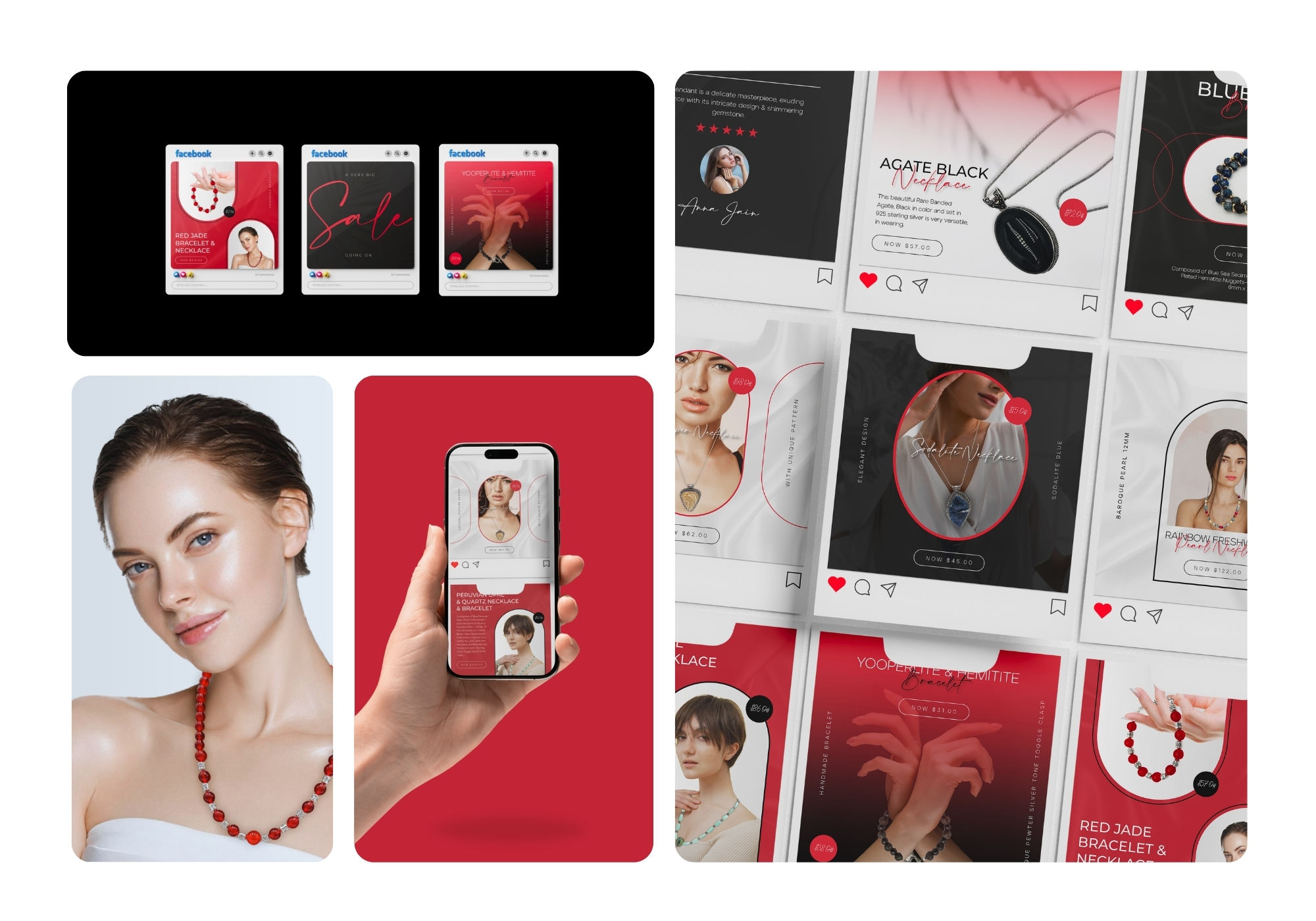
Sophisticated red-and-black e-commerce set spotlighting a gemstone jewelry line. Moody studio photography, elegant typography, and clear pricing tags give each piece a luxury feel while keeping the layout shoppable and conversion-focused.
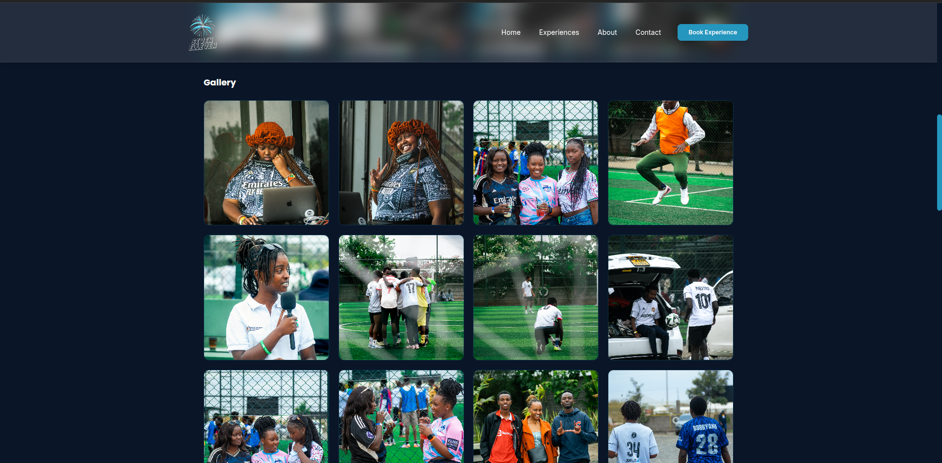
A dynamic platform built to bring the excitement of football events, tournaments, and fan experiences to life through premium activations and live match engagement.
View project
Sydney Brew wanted more foot traffic from locals searching for cafes. We improved their Google rankings for key terms, which brought in steady new customers every week.

The studio needed to fill more classes. We set up a simple welcome and nurture email sequence that increased sign-ups and repeat bookings.

They wanted emergency call-outs fast. We ran targeted Google Ads that lowered cost per lead and kept their phones ringing during busy times.

The Flour Pot needed to stand out online. We built a recipe blog that drove organic traffic and got locals coming in for their fresh bakes.

Perth Native Gardens struggled with local visibility. We optimized their site and content, helping them rank higher for landscaping searches.

Glow Skin wanted better retention. We created automated emails for appointments and offers that boosted repeat visits.

Morning Brew ran Meta ads to attract weekend crowds. It worked well — we cut costs while growing their Saturday sales.

They needed trust and leads. We wrote helpful study guides that ranked well and brought in more student inquiries.

Wildflower Co wanted to own 'local flowers Hobart'. We improved their maps and site, which increased delivery orders.

Sparkle Cleaners looked to turn one-offs into regulars. Our email campaigns helped with follow-ups and loyalty offers.

The surf shop needed seasonal sales. Targeted Google Ads brought in buyers looking for boards and gear.

Paws & Claws shared fun pet stories and tips. It helped them build a loyal local following and more bookings.

Active Physio wanted more appointment requests. We fixed their SEO, lifting them in local searches for pain relief.

Page Turners sent monthly recommendations. It increased online orders and brought more people into the shop.

They ran Google Ads for urgent jobs. We optimized it to get more calls without blowing the budget.

Sourdough Co posted baking tips and behind-the-scenes stuff. It helped grow their weekend market sales.

Outback Adventures needed visibility for small group tours. Better SEO brought steady inquiries from travellers.

Style Studio used emails for rebooking offers. It helped fill the books and keep clients coming back.

Fit Hub ran Meta ads for trial memberships. We refined targeting to get better sign-up rates.

Cycle Works created maintenance guides that ranked well and drove more service bookings.

Beach Bites wanted morning traffic. Local SEO improvements helped them show up for breakfast searches.

Canine Cuts reminded clients about grooming appointments. It smoothed out their schedule nicely.

Home Finders used Google Ads for property listings. It generated more leads for their small team.

Mindful Movement shared beginner yoga tips. The content attracted new students to their studio.

Tax Helpers focused on local tax searches. We helped them rank and pick up more small business clients.

Petal & Stem sent seasonal offers via email. It boosted orders around holidays and events.

Auto Care ran ads for servicing. It brought in consistent workshop bookings.

Bean Roasters wrote about coffee origins. It helped build their reputation and online sales.

Reef Explorers optimized for dive trip searches. Traffic grew and more people booked experiences.
Threads Boutique used emails for new arrivals. It kept their regular customers coming back.